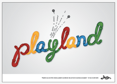
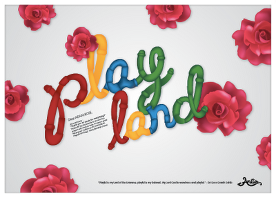
farewell card for peeps
4:08 AM this logo is meant to be for client work & it becomes the biggest joke
because of its shape and imperfect drawing, since it was for mocked up
so I did it very quickly to get the look and feel..
but it seems like this logo have dualism meaning.
what do you think the shape reminds you of? hehe..
however I have to fix it, for the sake of typography!
At last, I came up with better ideas for the client
and of course they bought it yay!
few days to go for the big shoot! I can't wait to see =)
There'll be update very soon.


0 comments